“Unlocking mobile design: Font essentials for seamless user experience”
Mobile design typography can vary significantly depending on the device and operating system.
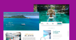
In the realm of mobile design, typography plays a pivotal role in shaping user experience and conveying your brand’s message effectively. With over six years of experience in the design field, I’ve honed insights into crafting compelling typography for mobile interfaces. Here are some key tips and best practices to master mobile typography:

Prioritize Readability: Mobile Design screens come in various sizes, so it’s crucial to select fonts that are legible across different devices. Opt for typefaces with clear letterforms and adequate spacing to enhance readability, especially on smaller screens.
Scale Appropriately on mobile design: Font size is paramount in mobile design. Aim for a balance between readability and aesthetics by scaling fonts appropriately for different screen sizes. Consider using responsive typography techniques to ensure text adjusts dynamically based on the device’s dimensions.
Limit Font Choices: While variety can be tempting, sticking to a few well-chosen fonts maintains visual consistency and improves user comprehension. Select a primary font for headlines and body text, and complement it with a secondary font for emphasis or variation.
Mind the Contrast: Contrast between text and background is essential for accessibility, particularly on mobile devices used in various lighting conditions. Ensure sufficient contrast ratios to accommodate users with visual impairments and enhance readability for all users.
Hierarchy is Key: Establish a clear hierarchy within your typography to guide users through content effortlessly. Utilize font weights, sizes, and styles to differentiate between headlines, subheadings, and body text, facilitating easier scanning and comprehension.
Whitespace Matters: Incorporate ample whitespace around text elements to improve legibility and create a visually pleasing layout. Adequate padding and margins enhance readability by preventing text from feeling cramped or cluttered on the screen.
Consider Brand Identity: Typography plays a significant role in conveying brand personality and tone. Choose fonts that align with your brand identity and evoke the desired emotions or associations, whether it’s professionalism, creativity, or friendliness.
Test Across Devices: Mobile typography can vary significantly depending on the device and operating system. Conduct thorough testing across different platforms and screen sizes to ensure font rendering remains consistent and legible across the board.
By implementing these font usage tips and best practices, you can elevate your mobile designs and create immersive user experiences that resonate with your audience. Remember, effective typography goes beyond aesthetics; it’s a powerful tool for communication and usability in the mobile landscape.
Do you want to know more about mobile design? click here